Now I don’t hate Windows by any means, and I use it as a daily driver myself, and that being said, I want what’s best for its development and future. It can only get better through criticism imo.
I keep seeing articles about Windows 11, so I collected some thoughts here for consideration.
In my last post about Windows 11, I pointed out that Windows 10 should have been iterated upon instead of Windows 11 being released. That post includes a few reasons I won’t mention again here including the taskbar button being moved to the center and destroying a key UX design feature that Windows themselves must have forgotten they implemented so long ago.
Let’s talk instead about more bad things about the OS that have come to light.
Duh
As usual, the new release of Microsoft’s major operating system has lots of bugs.
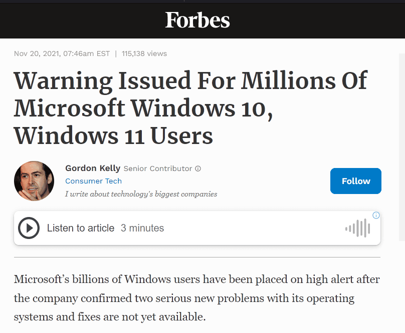
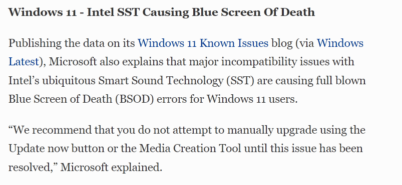
This is why I still recommend waiting for a while after release to upgrade, even if you like the new look of Windows 11.
When asked about the performance issues of the OS, Microsoft had this to say:
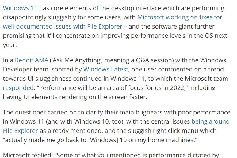
While they are aware Windows 11 is slow – this is a key reason I’m choosing to stay on Windows 10 for now. It took a long time for Windows 10 to get to a reasonably stable version, and I’m expecting the same for Windows 11. Give it a year or two and then see where it is.
Default apps settings
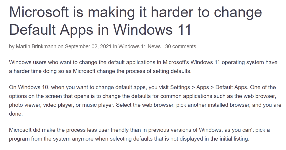
Surprise again, Microsoft is making it harder to change your web browser away from Edge. In Windows 11, you must change every file protocol related to html documents, links, and other web related entries as opposed to having a simple “Web Browser” option like in Windows 10. This is anti-consumer and doesn’t make using the OS easier at all.
Context menus
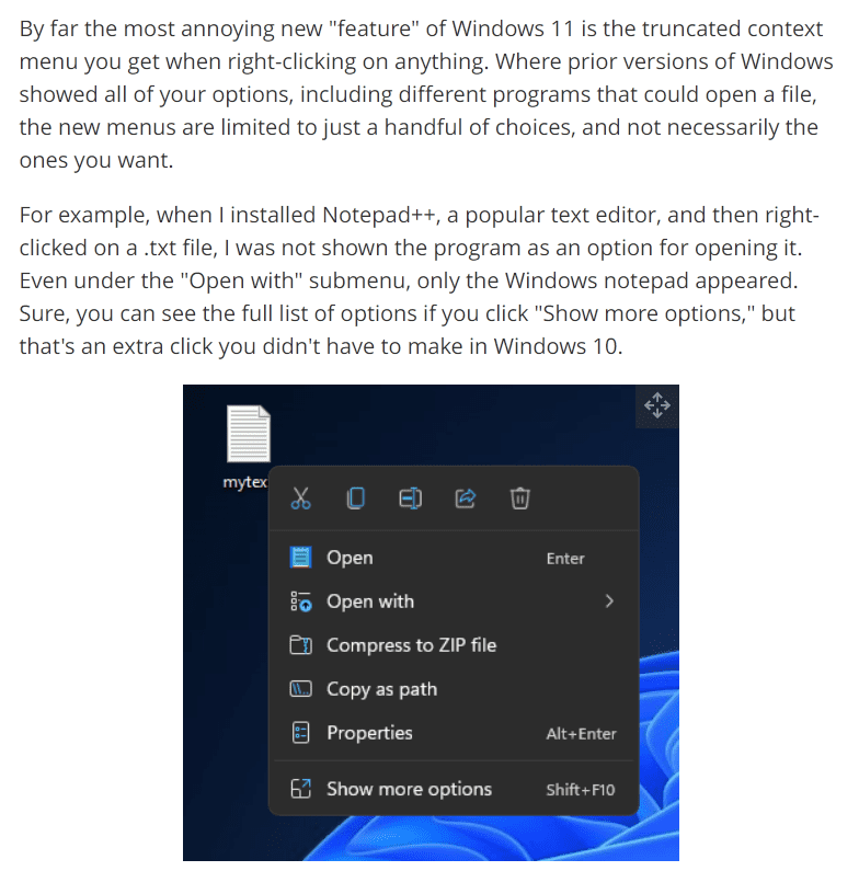
Context menu options that before were one click away are now hidden for “ease of use”. This may or may not be preferred by some though, I can see users who don’t typically need the extra context menu options being more encouraged to right click and use the simplified menu.
You can restore the full context menus with a registry hack though, so this isn’t as big of an issue. Still annoying that this is the direction they’re heading though.
Widgets
Here are the list of widgets currently available:
- Calendar shows you the current date and lists any upcoming events you’ve added.
- Entertainment lists films and TV shows that have recently released on the Microsoft Store.
- Esports displays recent Esports matches and results.
- Photos cycles through photos and images saved to your Microsoft account.
- Sports displays current sports scores and recent results. You can adjust which leagues and teams are shown.
- Tips provides brief advice for using various Microsoft software, including Windows 11 and Edge.
- To Do lets you create a list of tasks and displays it in the widgets menu. You can mark individual tasks as completed.
- Traffic displays a small map and describes the traffic conditions in your area.
- Watchlist shows stock values. Similarly to the Sports widget, you can choose which stocks appear.
- Weather shows current weather conditions in your area, as well as the forecast for the following three days.
info from (https://www.tomsguide.com/news/windows-11-widgets-everything-you-need-to-know)
Personally I don’t find the widgets they have interesting or useful in the slightest, and the widget pull out goes halfway across the screen, so it’s almost useless for multitasking. There are no community or custom widgets, so you are stuck with what Microsoft decides to develop. If I know them, they may release one or two more before forgetting about the feature entirely or disbanding the division of developers that work on it.
Removed Features
Courtesy to a reddit post,
As always Windows team takes a good step forward (New Design, store, settings, etc) with Windows 11 and then takes two steps back. Here are some of the lost features from Windows 10
harshag11
Start Menu
- Live tiles replaced with boring grid of icons
- No option to choose different App Icon sizes and end less customization options available in tiles grid
- No App Folders
- No option for Named Groups
- No way to resize start menu
- No option for full screen start menu
- No show more apps option (Current view displays only 18 apps without scrolling)
- Ability to remove pinned apps and show all apps view only
- Usability – Not mouse friendly, lot of mouse travel for every action. No way to remove recommended section, app and all apps buttons are far away from reach. Also you need additional click to reach All Apps. Even for touch users it is very difficult to reach new start menu or apps in two handed mode.
- No badges in start menu
- No option to pin settings to start menu
Task Bar
- Drag and drop files to running apps
- Cannot drag and drop app icons to pin to task bar
- No option to choose task bar location
- No option to choose task bar size
- Never Combine Labels options missing
- No option to turn system icons on/off in tray
- No clock on secondary monitor
- System time doesn’t show seconds
- Task bar context menu only settings option. No option to launch task manager, etc
- No toolbars in taskbar. Cannot add Address, Links, Desktop and Custom folders to Task Bar
- No screen snip in quick actions menu
- Shift + Click – No longer open new instance of an app
- No option to quickly change Power Mode (Best Battery Life, Best Performance, etc) from task bar
- Apps can no longer customize areas of the Taskbar
- Cannot view or add Calendar events from Taskbar
- People bar has been removed
Windows Explorer
- No refresh option in context menu, there are many instance where explorer fails to auto refresh.
- Context menu is missing many options like shortcut, send to, share with, restore previous version and 3rd party customizations (Windows has poor history of developers embracing new platform features, so not sure when Devs will add these to new menu)
- Quick access toolbar has been removed. So no option to pin my favorite commands like copy path
- Missing thumbnail previews for folders
General/Settings
- Extremely difficult to change default apps
- Cannot setup Windows 11 Home with local account
- Cannot setup Windows 11 Home without internet connection
- Desktop wallpaper cannot be roamed to or from device when signed in with a Microsoft account.
- Timeline has been removed
- No show windows stacked option
- No option to disable all background apps
- Win + K no longer works for Bluetooth devices (Even new quick settings also missing Bluetooth connection options similar to WiFi)
- New touch gestures doesn’t work well when holding tablet with two hands. Swipe from left edge has been replaced with widgets, switching apps now requires 3 finger gestures.
- When “Turn off the store application” and “Disable all apps from Microsoft store” group policies are configured, basic windows apps like notepad, mspaint, etc will not work. This also blocks users from launching cmd or powershell from Windows + X menu
To sum things up, Windows 11 is having some issues, as is expected of a needless full OS upgrade for feature removing UX and UI changes. ¯\_(ツ)_/¯
Remember, you can still customize your Windows 10 tiles without Windows 11 and get centered taskbar here.
And, if you aren’t afraid to install some tweaks onto your system, this ExplorerPatcher project aims to bring back a Windows 10 experience to Windows 11. Might be worth checking it out if you want to be on the bleeding edge updates, but also have a productive working environment.
It helps me if you share this post
Published 2021-11-21 19:09:40