Windows 11 is wholly unnecessary, and shouldn’t even exist.
If we ignore the fact that Microsoft stated Windows 10 was the last version of their operating system, and the seemingly obvious missed opportunity to simply rebrand Windows 10 to “Windows” alone like Apple did, then we can look at their proposed reasons for the change.
Why Microsoft is Rebranding
When Windows 10 came out, it was supposed to usher in a new standard of operating under the Microsoft family. The start menu was brought all the way back in comparison with Windows 8.1, and they finally fixed a number of graphical issues users were having.
The rebrand to Windows 10 was for the numerous changes they’d done to the operating system, back then.
So what changes to instigate a new OS now?
A New Name Means Distance from Old Identity
Changing a name is a great way to distance a person, place, or thing from old actions or non applicable qualities that exist currently. It’s a way to signal change, that something is not the same as before.
Microsoft and other corporations use this strategy often to create positive attention for their brand or distance themselves from negative attention.
And Windows 10 has had a lot of negative attention:

With the recent failure of Windows 10 X, Microsoft had enough.
So What’s New?
Really, that’s the most important thing, isn’t it? Are the changes any good?
Well, no.
Unless you want a bunch of features you could already achieve in Windows 10 with more bloat, more integrated applications, less customization, and more restrictions on which hardware you can install it on.
Windows 11 still has bloatware in the preview builds, and they’ve had updates before which has reinstall all preinstalled apps. Microsoft Teams will now be integrated into the taskbar. I don’t have high hopes for the Teams integration if the weather icon they tried to add to the taskbar and failed miserably with is any indication. The “News and Interests” taskbar option causes the taskbar to update arbitrarily and File Explorer to lag, and the font is grainy and pixelated on a monitor with higher than 1080p.
Well what about the centered taskbar?
Wouldn’t it be great if you could already do that in Windows 10?

Oh wait. You can.
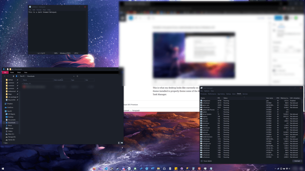
This is what my desktop looks like currently on 21H1. I also have a custom dark theme installed to properly theme some of the discrepancies out of the OS like the Task Manager, the dialogue options, and even Notepad.
Using TaskbarX, SecureUXTheme, and a few other dependencies, you can already create what I believe to be a better look than what Windows 11 delivers out of the box.
Changing UX Design
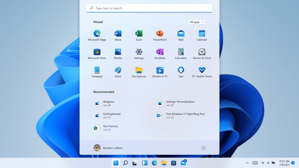
Notice that the start button is on the bottom left in the image above. Now look at a picture of the new Windows 11 taskbar:

The start button has moved to the center with the other icons.
THIS IS BAD UX DESIGN.
Why?
Because when a button is on an edge that you can move your mouse against, it has an infinite width. If you drag your mouse against the left edge of your (leftmost) monitor, it cannot move outside the screen and thus any button on the edge of the screen would be easier to quickly whip the mouse over and click.
In the same way, when a button is in a corner such as the start button was in most previous versions of Windows, it is much easier to drag your mouse to the corner quickly without aiming at all, as two sides have infinite width. This makes it extremely efficient to locate the start button, no matter the cursor location.
However, by moving the start button to the center of the taskbar, Microsoft eliminates that smart UX choice they made all those years ago.
Perhaps Microsoft will realize this and provide an option to restore the default alignment in a later update. As of 8/2/2021, this is not possible.
Additionally, they eliminated the option to align the taskbar to the left or right in the latest version.
The main concern for me as Microsoft continually whips around GUI updates is… how has Windows fundamentally changed since the last big update? And how are they fixing the small issues that continue to plague normal operations throughout the working day? Well, the answers to both of those questions are pretty disappointing.
A) It hasn’t changed that much, so don’t expect to notice much difference
B) They haven’t fixed that much, so don’t expect to notice much difference
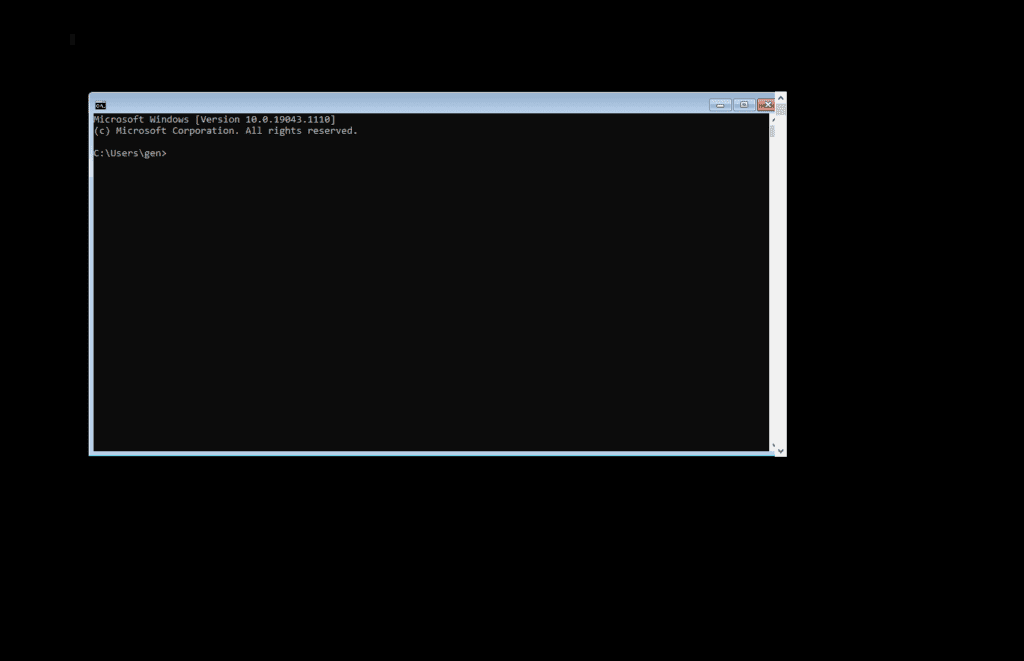
And that’s where we are. Another graphical change to an OS in an era where to this day, on the latest Windows build, you can open command prompt and hold F11 down to see the old Windows 7 UI underneath for a split second as the GUI is overwritten with the new theme.

Progress Is Not Bad
But there has to be progress. Windows 11 is completely unnecessary for what they are bringing to the table in the new versions. In a perfect world, maybe Windows 10 would have been rebranded to “Windows” with thematic naming to keep versions clear, saved the sweeping UI upgrades until AFTER THEY’VE FINISHED THE EXISTING DARK THEME FOR THEIR CURRENT OS, and maybe don’t make yet another “Settings” app before the old Control Panel is even removed.
I’ll say it again, I would love for Microsoft to be innovating here, but where is it? What can be achieved on Windows 11 that can’t already be accomplished on existing hardware and software?

I suppose nothing. It’s not like I would consider whatever Microsoft is shipping with their OS to be essential apps, probably just a new version of candy crush 😉.
At the very least, Microsoft says they will still support Windows 10 for 4 more years, until 2025. Maybe by that time, Windows Infinity will have hit shelves and I can skip 11.
Honestly, just please make one settings app and I’ll be happy. 🙏
It helps me if you share this post
Published 2021-07-27 18:55:20