Using a computer generally means doing one of a few common, repeating goals: listen to music, consume media content, create, connect, or have fun. The operating system is the bridge to accomplishing those goals.
Evaluating how well an operating system performs as this bridge involves a few key points.
- It offers quick, simple ways to achieve your goals
- It provides privacy and security in a straightforward way
- It gets out of your way
- And, hopefully (though less important), it doesn’t look like trash
When the capabilities of computers were still being explored, there was a clear drive to improve every aspect of the operating system.
Now, simplicity and “not confusing the user” often takes precedence, even if it sacrifices functionality.
As a side effect, computers become less useful for everyone. Instead of encouraging users to rise to the level of what the machine can do, functionality is stripped back and lowered to the simplest possible use case. The result is a system designed for the ideal but non existent lowest common denominator.
Windows
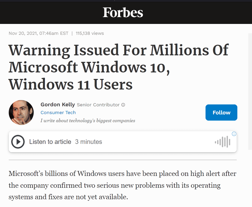
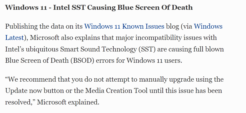
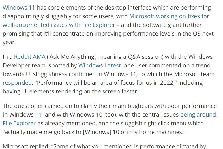
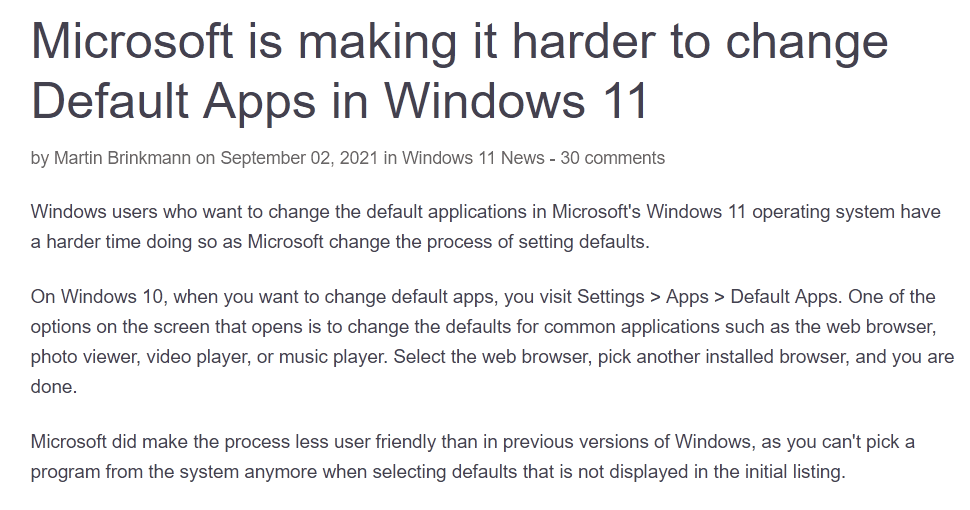
For example, the Windows 10 update was largely marketed as an attempt to polish the UI and create a more cohesive experience. That effort failed, largely due to a lack of clear direction within the company. Updating legacy UI components or fixing outdated Control Panel links to work with the modern Settings app doesn’t generate revenue, so management simply doesn’t care. The end result was a significant loss of user privacy, a slower interface, and fewer options.
With Windows 11, it feels like we’ve regressed even further; reinventing the wheel, repeatedly, and for no gain.
Windows 11 now assumes I need a slow-loading AI Chat to help solve problems that have had reliable solutions for years. Its latest major feature, “Copilot,” is just a rebranded Bing AI chat baked into the OS. Here are the Windows Settings you can modify:
Change Windows settings
In the chat pane try any of these:
- Turn on dark mode
- Mute volume
- Change wallpaper
Perform common tasks
http://web.archive.org/web/20231103070429/https://support.microsoft.com/en-us/windows/welcome-to-copilot-in-windows-675708af-8c16-4675-afeb-85a5a476ccb0
- Take a screenshot
- Set a focus timer for 30 minutes
- Open File Explorer
- Snap my windows
Why would I need to click, wait for Bing Chat to slowly connect to internet services, and then send off a query just to open File Explorer? “Snap my windows”? Instead of dragging a window to the edge in a fraction of a second, why would I want to ask a slow-loading chat to do it for me? Mute volume? Isn’t there already a hardware shortcut for that? If some sound is blaring and I need to mute it quickly, I’d never waste time going through the chat. I don’t need Microsoft to reinvent the wheel when it comes to changing my wallpaper or launching a troubleshooter that never works. Why can’t I ask it to create a firewall rule to block every program with ‘razer’ in its name? And why is the Control Panel still in Windows 11, two versions after they claimed they were consolidating everything into the new Settings app? It’s pure laziness.
Two years later, they’ve completely removed those ‘features’ from public view, and simply say it supports all the features the web version does. No improvements.
Erosion of User Trust
You may have heard the term “enshittification”, referring to the process by which a company first acquires users by acting in their best interests, then shifting to serve the company’s best interests once users are hooked. This is happening with the entire culture of the internet.
It’s become a pervasive pattern across the digital landscape. Tools are no longer designed to accomplish tasks; instead, they’re built to collect data, spy on users, manipulate behavior for profit, and create addictive experiences. The result is an environment that prioritizes corporate gain over user satisfaction.
The concept of the “user” is often treated as a mythical, incompetent being that needs constant protection. While learning often comes through trial and error (by breaking things), there’s a widespread desire for a perfect, effortless solution that simply doesn’t exist. I recently read that the Signal app refuses to add any options, as outlined in their design philosophy.
Development Ideology
Truths which we believe to be self-evident:
- The answer is not more options. If you feel compelled to add a preference that’s exposed to the user, it’s very possible you’ve made a wrong turn somewhere.
- The user doesn’t know what a key is. We need to minimize the points at which a user is exposed to this sort of terminology as extremely as possible.
- There are no power users. The idea that some users “understand” concepts better than others has proven to be, for the most part, false. If anything, “power users” are more dangerous than the rest, and we should avoid exposing dangerous functionality to them.
This sets an extremely dangerous precedent. Not only does it assume people are incapable of learning, but it also forces everyone using a computer to the same, incompetent level as the “ideal” user – the mythical stupid person. Rather than adding advanced features that could benefit users and push humanity forward, the focus shifts to making sure the app is foolproof.
This attitude has quickly spread across the digital landscape. Take Changelogs, for example. Once meant to document actual changes, they now rarely list anything concrete. These days, most update notes offer vague phrases like “Bug fixes and improvements,” with no real information. This stems partly from a condescending view of users (“they don’t need to know or wouldn’t understand the details”), and partly from the fact that most changes no longer benefit the user. Instead, they quietly push the app in a worse direction, hidden behind empty words.
Trust is a two way street. The less products trust their users, the less users trust the product.
When software is built on the assumption that users are clueless and untrustworthy, it erodes the relationship entirely. Removing options, hiding functionality, and oversimplifying interfaces signal that the product doesn’t respect the user’s intelligence or intent. In turn, users become skeptical of updates, of features, and the motives behind every change. Once that mutual trust breaks down, users stop engaging, stop exploring, and eventually stop caring.
What We Can Do
Put your energy into products that genuinely respect the user. Don’t support this growing trend of junk food tech, designed for easy consumption but empty of real value. Exercise your right to ownership fully and freely. Don’t hesitate to push back against companies that exploit your time, attention, and data without accountability. Scream as loud as you can. Seek out tools that empower rather than pacify. Support software that offers transparency, flexibility, and control, not just convenience. Change won’t come from passivity; it will come from users demanding better, choosing alternatives, and refusing to settle for less.
Alternatives
The most important thing is to stop encouraging massive corporations to make their products even more user-hostile. You can do this by seeking out alternatives and, as the saying goes, voting with your wallet. Here are a few options to start with, and there are always more out there.
| Category | Common Proprietary Product | Alternative | Notes |
|---|---|---|---|
| Web Search | Google Search | DuckDuckGo | Privacy respecting search engine with great similar performance. |
| Browser | Chrome / Edge / Safari | Firefox | Maintained by Mozilla; one of the only other browsers not built on Google code. ALL Chromium based browsers are helping Google. |
| Gmail / Outlook | Proton Mail | Privacy respecting email with a desktop app. | |
| Office Suite | Microsoft 365 / Google Workspace | LibreOffice | Full office suite, compatible with most file formats. |
| Cloud Storage | Google Drive / iCloud / OneDrive | Nextcloud | File sync, collaboration, and app platform; self-hostable. |
| Calendar | Google Calendar / Outlook Calendar | Nextcloud Calendar | Part of the Nextcloud ecosystem. |
| Maps & Navigation | Google Maps / Apple Maps | Organic Maps | Offline maps, based on OpenStreetMap, privacy-friendly. |
| Operating System | Windows / macOS | Linux | Ubuntu is recommended. |
| Video Conferencing | Zoom / Teams / Google Meet | Jitsi Meet | Encrypted, open-source video chat, usable without accounts. |
| Notes | Evernote / Google Keep / OneNote | Joplin | Markdown support, sync, encryption. |
| Messaging | WhatsApp / Messenger / iMessage | Element (Matrix) | Secure, decentralized communication platform. |
| Photo Management | Google Photos / iCloud Photos | PhotoPrism | Self-hosted AI photo manager with tagging and search. |
| Translation | Google Translate | Apertium | Multilingual machine translation engine. |
| Tasks / To-Do | Microsoft To Do / Google Tasks | Tasks.org | Android app supporting local and CalDAV sync (e.g., with Nextcloud). |
| Spreadsheets | Microsoft Excel / Google Sheets | EtherCalc | Real-time collaborative spreadsheet editor. |
| Documents | Microsoft Word / Google Docs | LibreOffice Writer | Word processor in the LibreOffice suite. |
| Forms & Surveys | Google Forms / Typeform | LimeSurvey | Advanced, customizable survey platform. |
Some alternatives may require learning more about your computer or adjusting your habits. That’s okay. Change doesn’t need to happen all at once. In fact, trying to cut everything off immediately will lead to frustration and burnout, making it likely you’ll give up and fall back into old patterns.
Start small. Stop paying companies that would hold a gun to your head for the next payment if it was legally allowed. Use an Adblocker (recommended by the FBI). Stop paying Google for YouTube Premium and instead use Invidious Instances and GrayJay. Stop paying for Microsoft 365 and start using LibreOffice for projects that allow it.
It’ll only getting better as more demand a return to simpler times: when the computer served the user.
It helps me if you share this post
Published 2025-05-12 07:00:00
